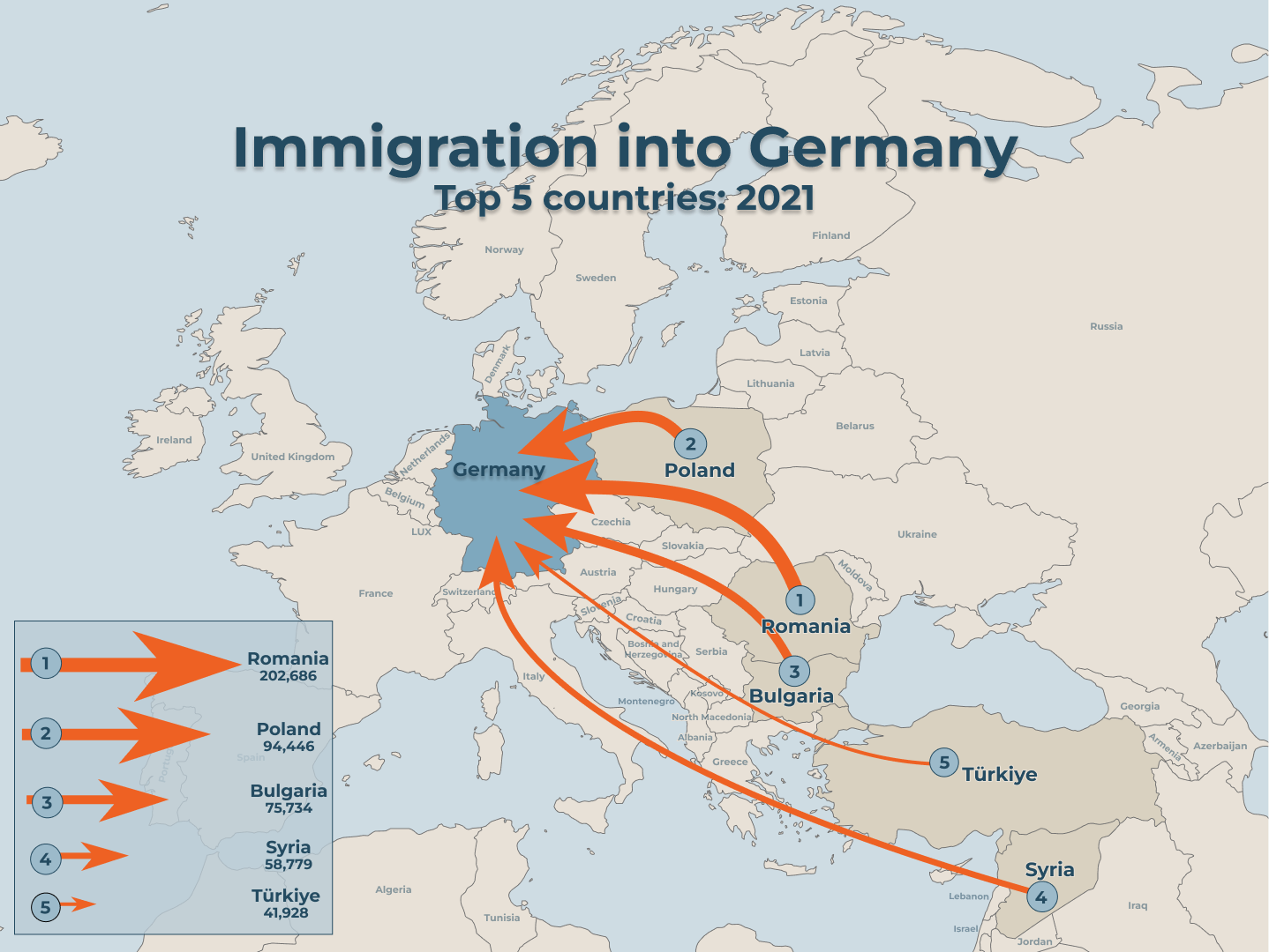
This project aims to analyze user experience with different map designs, focusing on immigration into Germany from the top five countries with the highest immigrant numbers in 2021. Multiple designs were created, and user interviews, featuring two specific questions, were conducted. Response times were recorded for comparison based on mean values, with a shorter response time indicating a more effective and user friendly design. A final map design, resulting from these user experiences, was created.
An Investigation of Map User Experience: Immigration into Germany
"Bringing users into the forefront of map design."
The final map result, utilizing knowledge gained through user experience testing.
What it is about
How we built it
All data was collected from the Organization for Economic Cooperation and Development (OECD) Library. The data processing was done within the OECD Library to begin with, before downloading for further processing and use into Excel. Microsoft Excel, ArcGIS Pro, AutoCAD, and Figma were all used in the processing and creation of our project. To systematically evaluate user experience, four sets of maps were generated. During the user experience evaluation, participants were presented with a set of maps from one of the four sets. Subsequently, the average response time was calculated. Each map design was also given a final grade on a scale of 1 to 5; 1 being difficult to understand and 5 being very easy to understand.
Challenges we ran into
An issue we ran into was during interviews, many people have differing opinions on the correct flow of the map. These differences were mostly preferential such as some users who found themselves more attracted to aesthetic colors and fonts and some being more attracted to bold, clear, and concise visualizations.
What we're proud of
Within our limited experience building maps for the general public, we are proud of the result; a visually pleasing and simple result displaying all steps of our user experience test. We enjoyed the process of learning from our peers and users of the maps especially discussing all small aspects of map making and creative parts of maps with them.
What we learned
We learned how to correctly implement a user experience survey and conduct a more efficient and effective user study. We were able to work on our use of cartographic principles and had a ton of practice making maps! The creative process and developing skills using ArcGis Pro and Figma as well AutoCAD were all major bonuses in the beginning to end of the project. Project management and time management in small groups were also worked on and practiced throughout the course.
What's next
In the ideal, the future of this map data set would include the animating of this data into a more movement focused map as the biggest and most important feedback from users was stressing the importance of a flow in the data and connecting it with immigration.
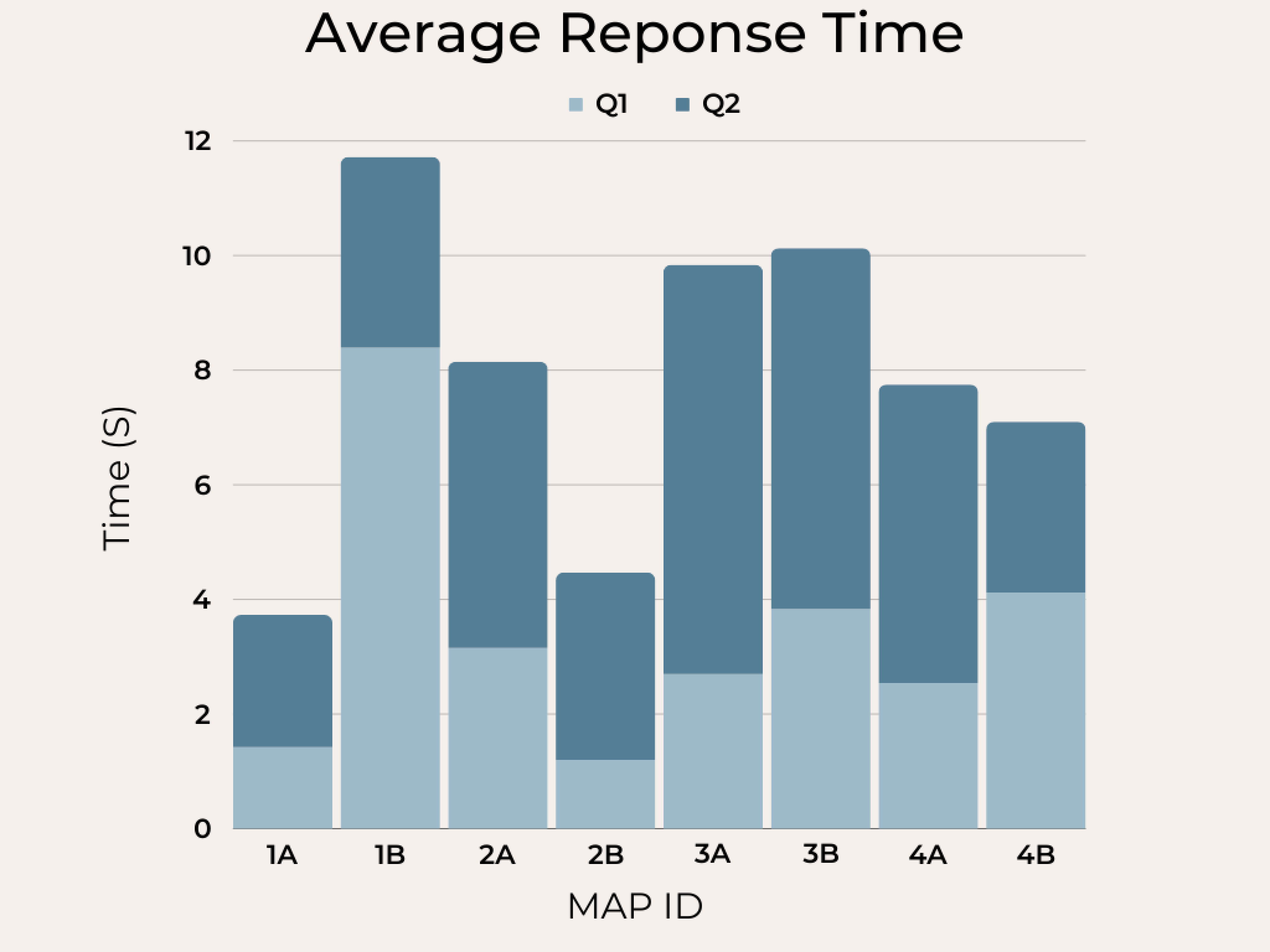
Graph depicting the average response time for questions 1 and 2 across the 4 map sets.
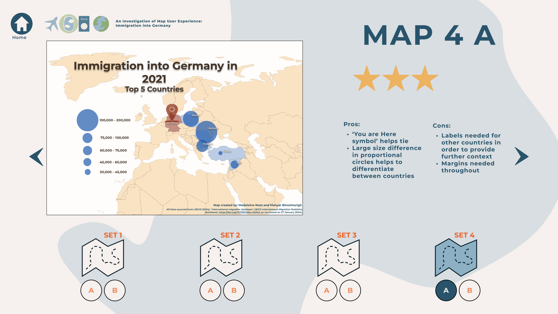
Example of the grade given to a map set and list of pros and cons mentioned by the users.
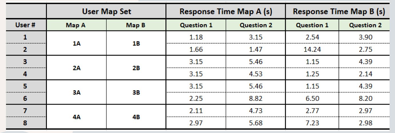
Data collected from user testing.
Students
Madeleine Noet
Mahyar Bineshtarigh
Mahyar Bineshtarigh
13th intake
Supervisor
Juliane Cron, M.Sc.
Keywords
Immigration, flow map, thematic mapping
Try it