Towards a ubiquitous place accessibility information: OpenStreetMap Accessibility Coverage

"Global distribution of place accessibility data."

What it is about

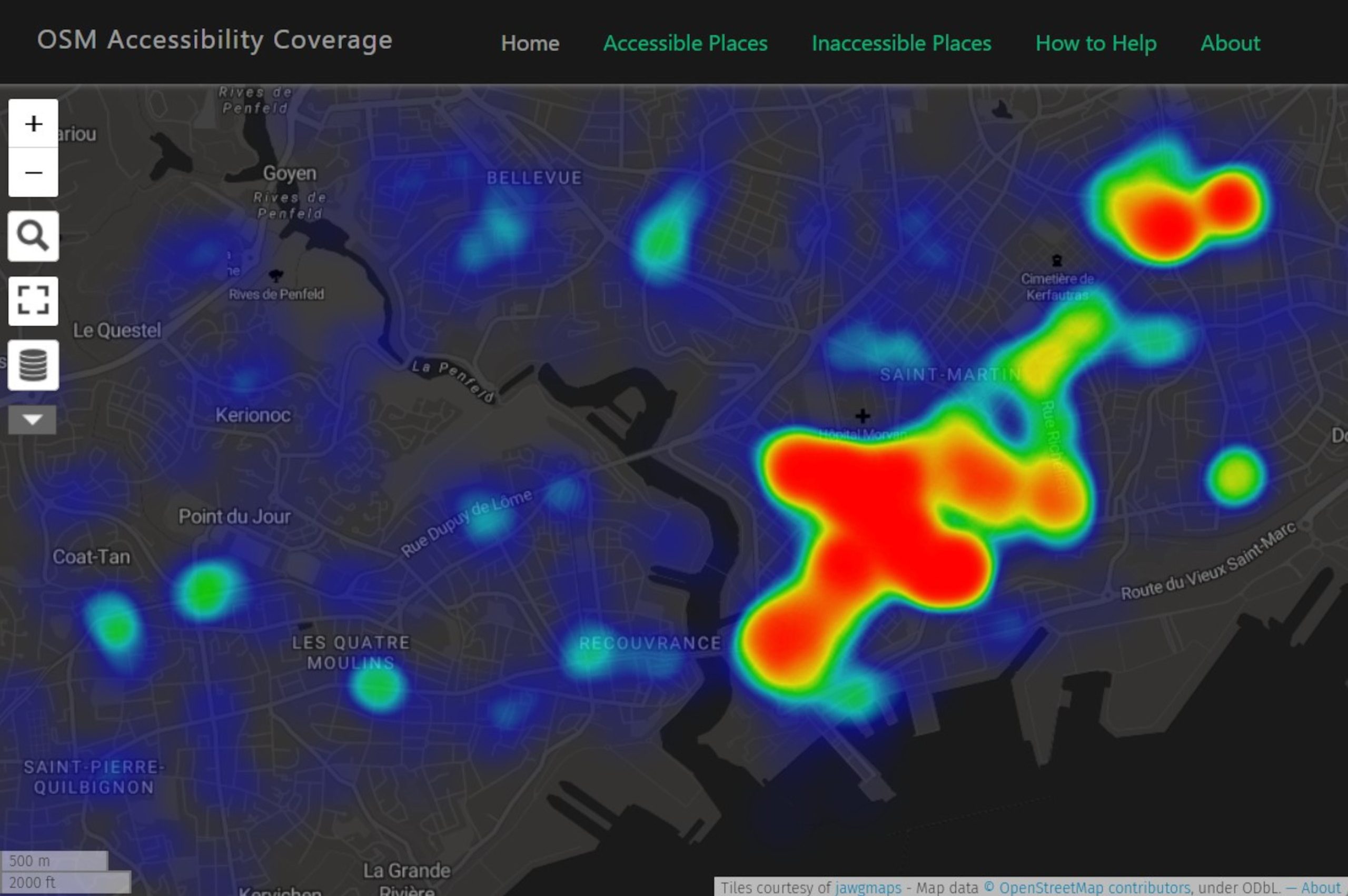
It was our aim to show the distribution of data about the accessibility of places. Using OpenStreetMap which has open geodata with worldwide coverage, we identified objects that can have accessibility attributes and visualised their distribution using heat maps. The result of the project is three heat maps. The first map shows objects that have accessibility attributes. The second and third maps respectively show objects that have attributes that imply a place is accessible or inaccessible to people with different kinds of impairment (visual, mobility and hearing).
The overall objective is to improve the volume of data on accessibility so we also provide information on how to add such data.

How we built it

Firstly, the OSM tags related to accessibility were identified via the OSM Wiki and the TagInfo website. Based on this data the tags were grouped by Points of interests, e.g. buildings, crossing etc. and by impairment, e.g. visual, mobility etc.
Secondly the necessary queries were created and the data was extracted via the Overpass turbo API. Each query describes one category/layer of data, e.g. inaccessible places for mobility impairment is based on one query.
Thirdly, the extracted links were then integrated as a layer into uMap. Three independent maps were generated. One for Home, one for Accessible Places and one for Inaccessible Places. These links always download the specified data when opening the map and are therefore always up to date.
The uMaps were then integrated into the webpage, which we built with Vue.js framework.

Challenges we ran into

The data collection process was difficult because OSM data is scattered all over the place and finding reliable information about it is not easy. It was necessary to develop criteria for choosing tags and acknowledge that we cannot include all of them. Another challenge is that, since the maps rely on live queries it takes a bit of time to render the heat map in areas with large data.
Regarding the visualisation we faced the issue that the default colour scheme of uMap might not entirely fit our data as it does not seem to be intuitive for users. A few users that were shown the map associated something negative with the colour red and therefore thought at first that red places always show inaccessibility, although it means that there is a lot of information.

What we're proud of

Integrating such an amount of data onto a map and selecting it in the first place is the key part of this project and the part we are most proud of.
Next to the project, we are happy about how we managed to conduct it. We finished nearly everything the way we had planned it in the beginning and coordinated ourselves quite efficiently, even during the lecture break. We did not have to scale down on our aim.

What we learned

We mostly learned new programming skills in HTML/CSS/JavaScript and improved our knowledge on mapping for people with accessibility and open mapping in general. Also we became more sensitive towards issues of accessibility, when walking through the streets of Munich.

What's next

Our project relies on live queries from OpenStreetMap, inasmuch as it is awesome to always have the latest data it can also be resource intensive and not optimal in areas with a lot of data. We suggest that anyone who plans to build on this project should consider creating and displaying the data as raster tiles for a more efficient display.

Sources

AccessMap (2019): Taskar Center for accessible technology. accessmap.io [accessed 31.10.2022]
Gleeson (1999): Geographies of disability. 1st Edition. New York. Routledge.
Netek, R.; Pour, T.; Slezakovka, R.; (2018): Implementation of Heat Maps in Geographical Information System – Exploratory Study on Traffic Accident Data. Open Geosci. 2018; 10:367–384
OpenStreetMap (2004): Berlin. fossgis. openstreetmap.org [accessed 31.10.2022]
Tannert, Kirkham, Schöning (2019): Analyzing Accessibility Barriers Using Cost-Benefit Analysis to Design Reliable Navigation Services for Wheelchair Users. In: D. Lamas et al. (Eds.): INTERACT 2019, LNCS 11746, pp. 202–223, 2019.
Wheelmap (2010): Berlin. Sozialhelden e.V. wheelmap.org [accessed 31.10.2022]
Students
Samuel Manu Darkwah
Lennart Kerl

12th intake
Supervisor
Juliane Cron, M.Sc.
Keywords
Accessibility, OpenStreetMap, HeatMap
Try it