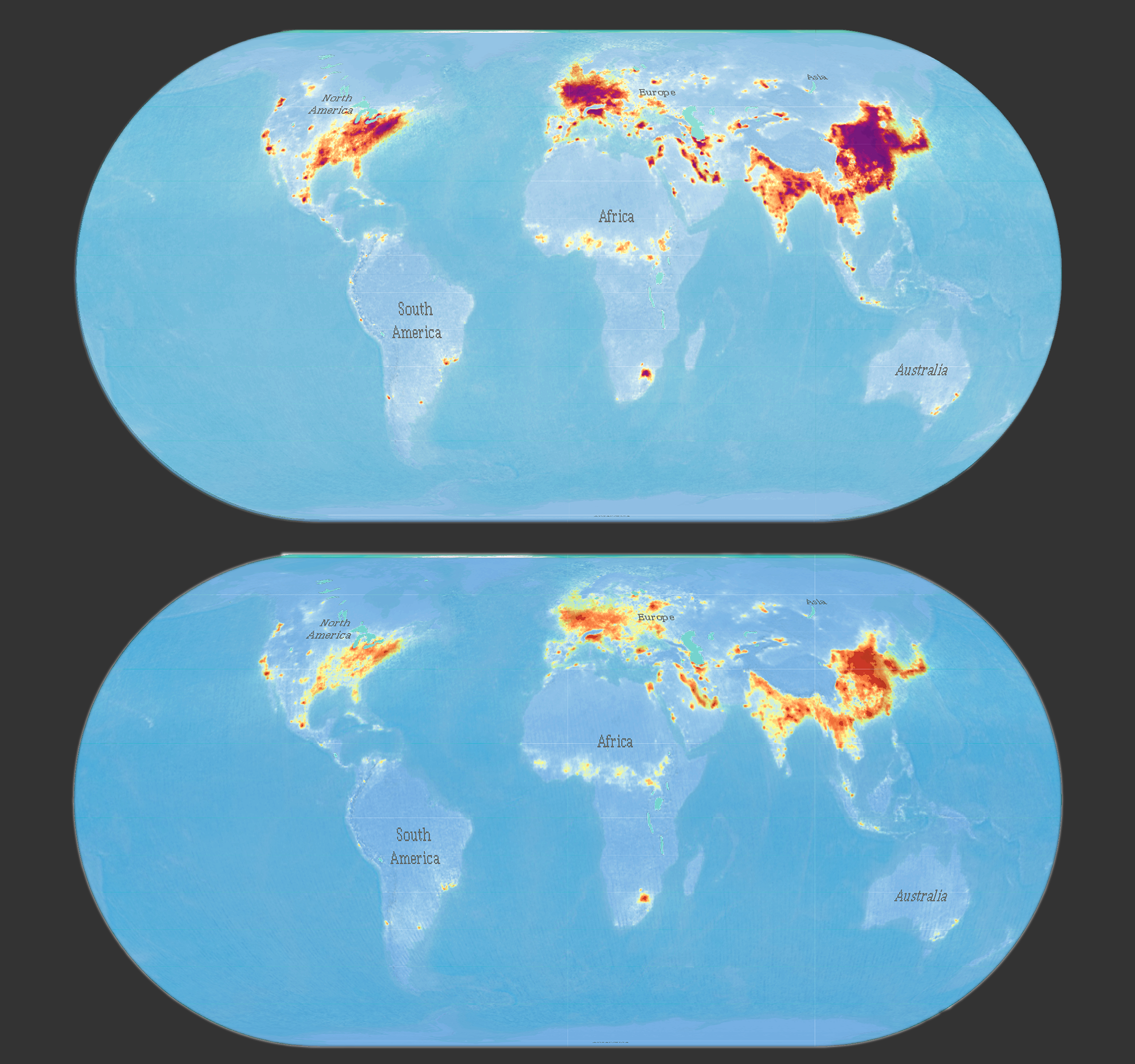
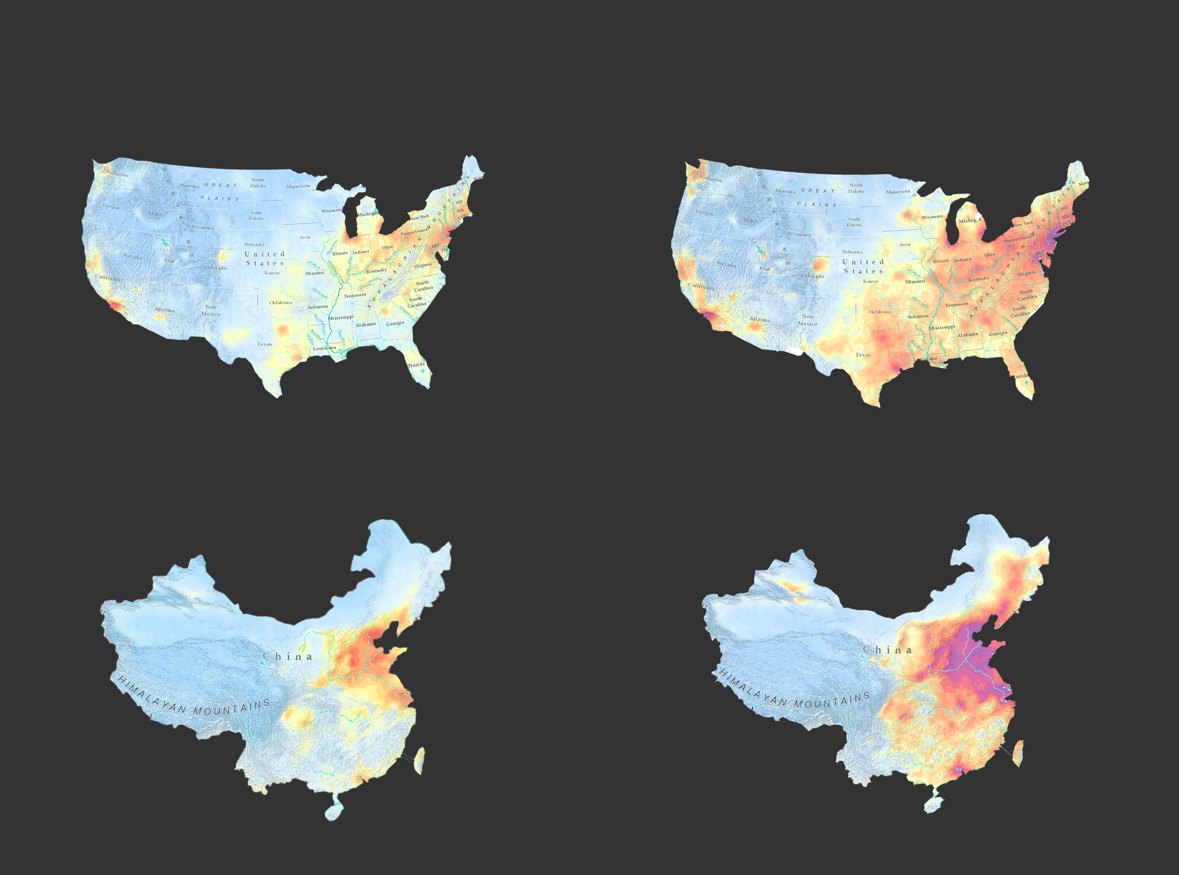
An Environmental ‘Empathy’ Gift from Cartographers

“Build up your empathy for environmental protection according to maps.”

What it is about

‘Empathy’ is the capacity to place yourself in others’ position via understanding or feeling in the same way.

If you look at the keywords of our project, which is COVID-19, NO2 and Remote Sensing, you might think this is completely irrelevant to you, unless you are an environmentalist. However, we believe everyone can contribute to the environment but not everyone knows the environmental knowledge as professionals. Therefore, we decided to make some maps that can improve your ‘understanding’ and ‘feeling’ on air pollution and environmental protection. In other words, you can comprehend it without any difficulties.
The maps analyzed how COVID-19 had impacted on NO2 pollution by comparing concentration changes on monthly basis during the lockdown period in 2020 with the same time in 2019. Every person from every country had experienced this challenging times. That’s the reason why we made a comparison of NO2 concentration in a world map. Because all of you are the protagonist in this ‘story’, it’s your right to know what happened in your environment. Furthermore, 12 countries from 6 continents were analyzed specifically for detailed distribution of NO2’s concentration. This allows you to put yourself into the context that you are familiar with and to explore more interesting phenomena. For example, why NO2 concentrates on some cities or regions rather than others? What factors contributed to this distribution (e.g., population, industrial district, weather, etc.)? The maps are devoted to establish an empathy bridge between you and in the field of environmental protection.

How we built it

Data Acquisition
The primary spatial data in this project is the concentration of NO2 in different time range. All data is acquired from the NASA Earth Data website which is a public open-access for providing satellite image data. The specific variable type in our research is the ‘Tropospheric NO2 Column’ (30% Cloud Screened) rather than the ‘Total NO2 Column’ because tropospheric change particularly indicates the NO2 pollution from human activities.
 
Data Visualization
ArcGIS, QGIS, Adobe Photoshop were the main software in the process of data visualization for our poster. Additionally, web-mapping was mainly conducted in Visual Studio Code (VSC) with JavaScript libraries and HTML/CSS. The raw satellite images data were firstly converted into the tiff format for further analysis. Afterwards, they were interpolated by using the Kriging interpolation method to smooth the interval between pixels and enhance linear between maximum and minimum values, which gave a better visualization on final result. It is important to mentioned that, owing to the worldwide research scale, all maps’ projections were ‘customized’ for eliminating distortions. For instance, large area countries with east-west orientation such as China and USA were projected in conic conformal projection.

Challenges we ran into and achievements we are proud of

The biggest challenge is that we do not have enough time to achieve more detailed maps for more countries or regions. As cartography students, we believe our aim is not only to make a precise and accurate map but to be a ‘spatial data journalist’ to communicate geospatial information in an interesting and enjoyable way. That’s the reason why we made 12 maps from all inhabited continents (except for Antarctic) in this planet. Because we believe this will give these continents and countries’ people a more emotional connection between environmental protection and themselves.

What we learned

Except for the varieties of cartographic technique skills that we learned and practiced during the map making, the most impressive part we had is the changes and distribution of NO2. We are really interested in explore more behind our research as the results showed a sharp decrease of NO2 pollutions from 2019 to 2020 in all observed countries. For example, the context is that the lockdown policies reduced human activities by only allowing remote work and limiting contact with others. And we can learn from the result is that the decrease of the emissions from cars, buses and power stations indeed played an outstanding role in decreasing the NO2 pollutions.

What's next

According to this research, the pandemic presented an ‘experiment’ for environmental protection. In other words, as shown by the comparison maps, gas power vehicles and power stations have contributed the most to the NO2 pollution. Therefore, pursuing renewable energy vehicles and eliminating power station pollution provide two major directions for environmental protection.
Students
Yiwei Wang
Zhiheng Jiao

10th intake
Supervisors
Juliane Cron, M.Sc.
Dr.-Ing. Mathias Jahnke
Keywords
COVID-19, NO2, Remote Sensing
Try it