This project is an investigation on the spatio-temporal relationships between government mandated lockdowns and unemployment during the COVID-19 pandemic in 2020. Although there are many factors at play to explain the employment condition of a given time and place. However, in this extraordinary circumstance, interruptions to economic activities caused by government mandated lockdowns had played a significant role in employment conditions, with varying degree of effect on employment distributed unevenly in a population of more than 330 million people. Our goal is to illustrate this employment disparity and highlight its relationship with government mandated lockdowns in an interactive, visual medium.
The Unemployed States of America
“An investigation on the spatio-temporal relationships between government mandated lockdowns and unemployment.”

Snapshot of the Map
What it is about
How we built it
The initial task involved synthesizing raw unemployment data from the U.S. Bureau of Labor Statistics [1] and lockdown data from state government offices [2] to compile a GeoJSON file. With this data source, we were able to create a “slippy” web map with the open source JavaScript library Leaflet. We further augmented the Leaflet library with plugins to implement specific features that we believe are essential to communicate our cartographic message.
Challenges we ran into
We have encountered extreme difference of opinions between team members at all stages during the development of this project. This ranged from project topic, project title, general directions, visualization medium, specific member’s responsibilities, design styling, all the way to the very language used in this paragraph. With both team members hailed from a diverse cultural background, this proved to be very challenging when consensus is needed to advance the project in a timely manner. Additionally, there were technical challenges as we had limited knowledge on the software stack such as D3 to make bespoke web maps possible. We resorted to use Leaflet instead, which was more functional for our needs.
What we're proud of
Although we are perhaps hesitant to descript our map as “stylish”. We feel we had made the correct design decision for the most part. The combination of each visual element had produced a final product that is more than the sum of its parts. We made the decision to minimize descriptive text on the map as we are very confident of its ability to communicate its cartographic message to our audience.
What we learned
Despite the interpersonal and technical setbacks, we made just enough compromises with each other and learn just enough Leaflet to achieve a final product we have envisioned. We are almost certain we had barely scratched the surface on web mapping’s potentials, but with the collaborative streak we are on and the creative swag we have earned, we look forward to future challenges.
What's next
As the COVID-19 pandemic is still ravaging our society, the full scale of its devastation remains to be comprehensively understood. No doubt there will be postmortems to reassess the damage for many years to come. We will continue to monitor the situation and look for new opportunities to present new insights.
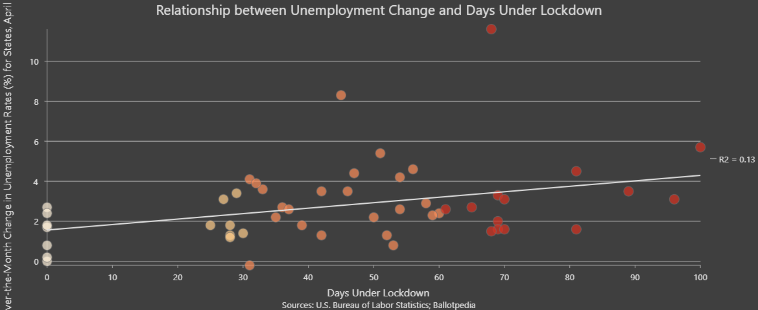
Correlation graph comparing unemployment change % during April 2020 with days in lockdown from all 50 States and District of Columbia.
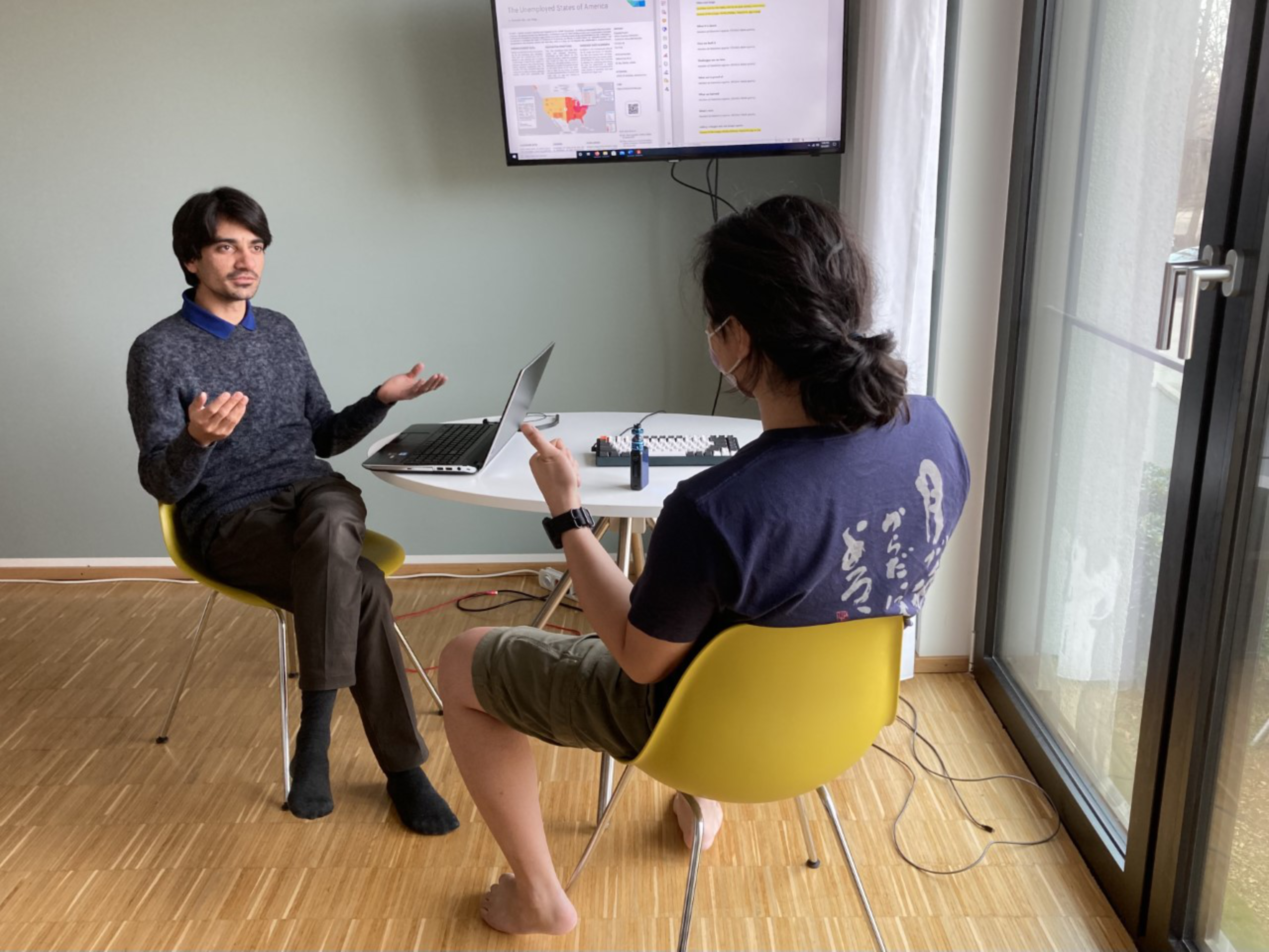
Another heated debate on lunch options.
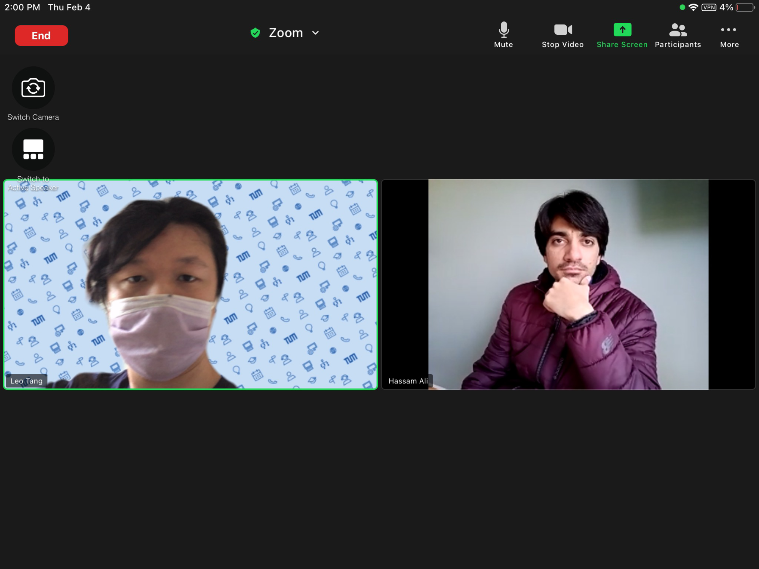
The debate continues on Zoom...
Sources
[1] BLS, Local Area Unemployment Statistics, 5 January 2021. https://www.bls.gov/lau/
[2] Ballotpedia, States that issued lockdown and stay-at-home orders in response to the coronavirus (COVID-19) pandemic, 5 January. https://ballotpedia.org/States_that_issued_lockdown_and_stay-at-home_orders_in_response_to_the_coronavirus_(COVID-19)_pandemic,_2020
[2] Ballotpedia, States that issued lockdown and stay-at-home orders in response to the coronavirus (COVID-19) pandemic, 5 January. https://ballotpedia.org/States_that_issued_lockdown_and_stay-at-home_orders_in_response_to_the_coronavirus_(COVID-19)_pandemic,_2020
Students
Hassam Ali
Leo Tang
Leo Tang
10th intake
Supervisors
Juliane Cron, M.Sc.
Dr.-Ing. Mathias Jahnke
Dr.-Ing. Mathias Jahnke
Keywords
Covid-19, unemployment, lockdown
Try it