The Covid-19 pandemic has deeply affected everyday life: countries have shut down, closed their borders and enforced movement and gathering restrictions. Social interaction has been put to a minimum, and people's happiness has been affected. This map shows the tweets during the pandemic, between November 2020 and January 2021, to see how people's happiness is distributed over time in the study area in the unit map in the form of a hexagon.
Visualizing People’s Happiness during the Covid-19 Pandemic with Twitter Data
“The visualization of people’s happiness during a pandemic need to be a temporal data visualization due to the changes of restrictions in the study area. Twitter data provides the information we need to visualize since it represents what people feel from time to time.”
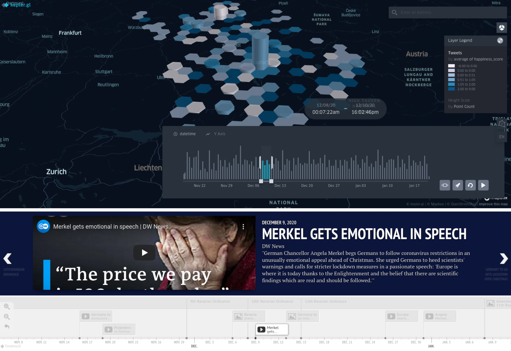
Screenshot of the project website.
What it is about
How we built it
We first fetched the data from the Twitter API. Later, the tweets are processed using Python, extracting the date, location and text. The text gets matched against the Afinn dataset, resulting in a happiness score for each tweet.
The visualization of the data in a dynamic map is done with kepler.gl, a powerful JavaScript library for spatial analysis. Finally, the website is complemented with a timeline made with Timeline JS, where the most relevant regulations and news related to the current Covid-19 pandemic are covered, for the final user to analyze and interpret the results.
The visualization of the data in a dynamic map is done with kepler.gl, a powerful JavaScript library for spatial analysis. Finally, the website is complemented with a timeline made with Timeline JS, where the most relevant regulations and news related to the current Covid-19 pandemic are covered, for the final user to analyze and interpret the results.
Challenges we ran into
The limited access of data fetching from Twitter, with strong API limitations for free accounts. Also, the geotagging of the Tweets in big cities can be a problem, as most of the tweets’ location are just a bounding box of the whole city.
What we're proud of
The hexagon tessellation can evenly cover the study area and fix the Twitter location problem. Furthermore, the users are able to adjust the time span with sliding the datetime tool. It is also possible to match the date with the timeline which shows the events happen at the moment.
What we learned
From this project, we learned how to solve the challenges we face about the limitation of data we have. Also, how to find a visualization alternative when the data does not meet our expectations.
What's next
The study area of this project can be expanded for the larger observation, for instance whole Bavaria or Germany to see more trends. Furthermore, it will be great to synchronize the datetime in the map with the timeline so that the users can analyze it easier.
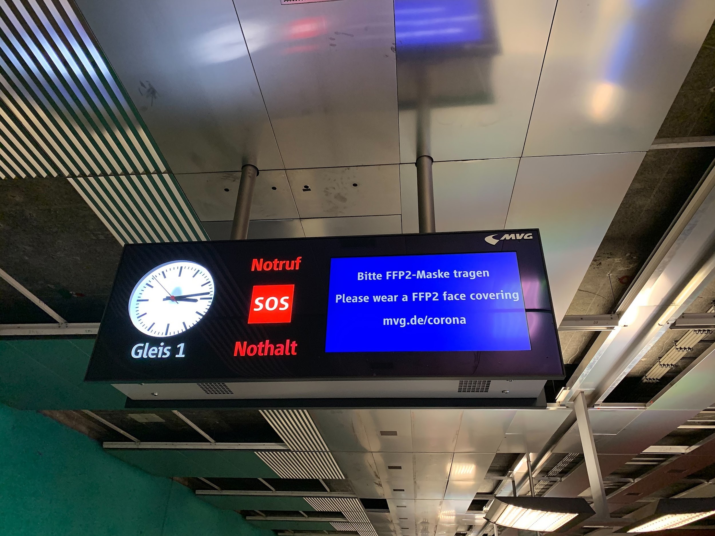
Screens in the Munich U-Bahn informing about the obligation to wear FFP2 masks. Own picture by Héctor Ochoa Ortiz.
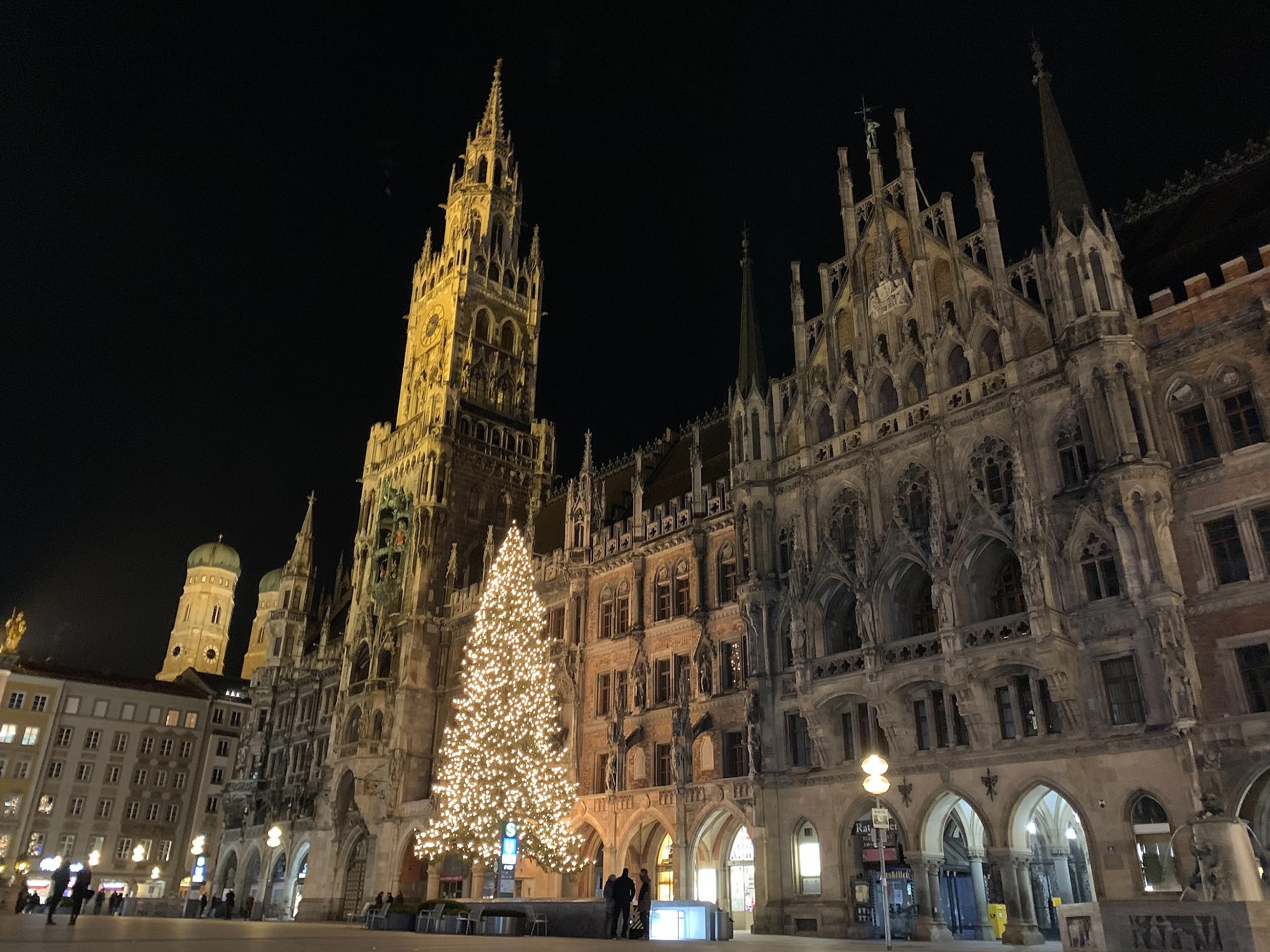
A deserted Marienplatz (Munich) in December 2020. Own picture by Héctor Ochoa Ortiz.

The example of how the restrictions change affect people’s happiness. When the prohibition of drinking alcohol in public is no longer enforced, the happiness score reaches 13.00.
Students
Héctor Ochoa Ortiz
Zulfa Nur’aini ‘Afifah
Zulfa Nur’aini ‘Afifah
10th intake
Supervisors
Juliane Cron, M.Sc.
Dr.-Ing. Mathias Jahnke
Dr.-Ing. Mathias Jahnke
Keywords
Covid-19, happiness, hexagon map
Try it